Wheelhouse Between Reputation and Reinvention
Wheelhouse emerged from the long-standing reputation of Steve’s Tires, a trusted local shop known throughout the community of Houston, Missouri. When new ownership stepped in, the ambition was not to erase that legacy, but to elevate it. In a category often defined by outdated branding and limited perception, the business needed to signal a new standard while preserving hard-earned trust. Through strategic repositioning and a disciplined identity system, Wheelhouse launched as a modern auto authority balancing legacy and leadership.
Industry
Automotive
Services
Brand Strategy
Brand Identity
Verbal Identity
Merchandise
The Tension
Independent tire and auto shops operate in one of the most competitive local markets in America. National chains dominate through scale and brand recognition, while long-standing local garages often rely on reputation alone. In many cases, perception lags behind capability, and strong service is undermined by outdated branding and limited positioning.
Steve’s Tires had earned genuine community trust over years of dependable work. That reputation was an asset. But as new ownership took over with plans to expand services and raise standards, the business needed to signal change without sacrificing familiarity. The challenge was not to replace trust — it was to carry it forward under a more ambitious vision.
The opportunity was to redefine the shop before the market defined the transition. By anchoring the brand between legacy and leadership, we established a strategic foundation that honored the goodwill Steve built while positioning Wheelhouse as a higher-standard, forward-looking auto authority.
The Expression
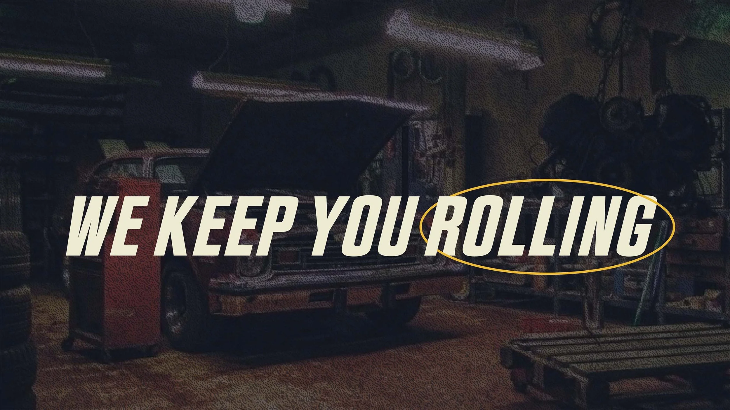
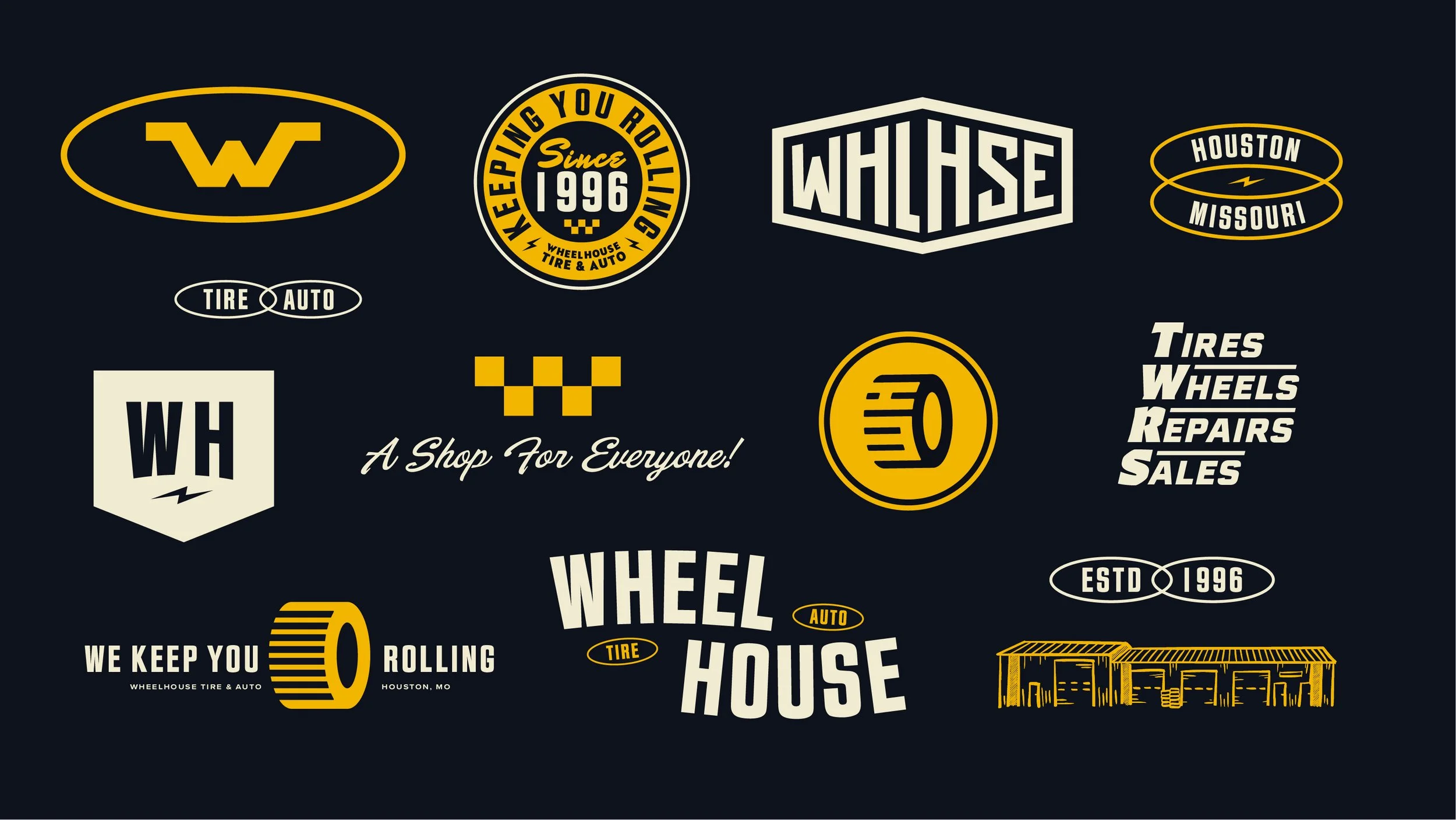
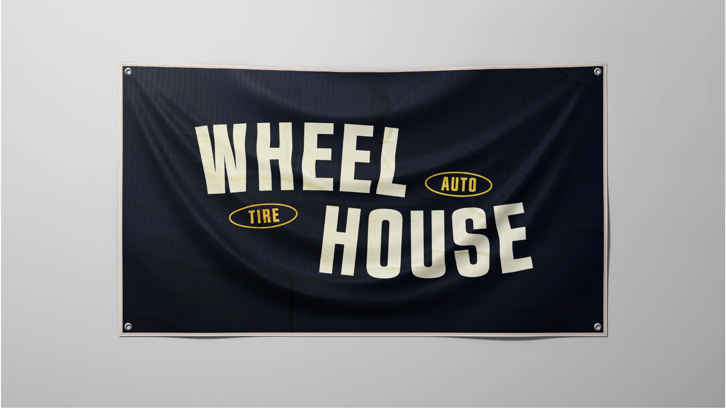
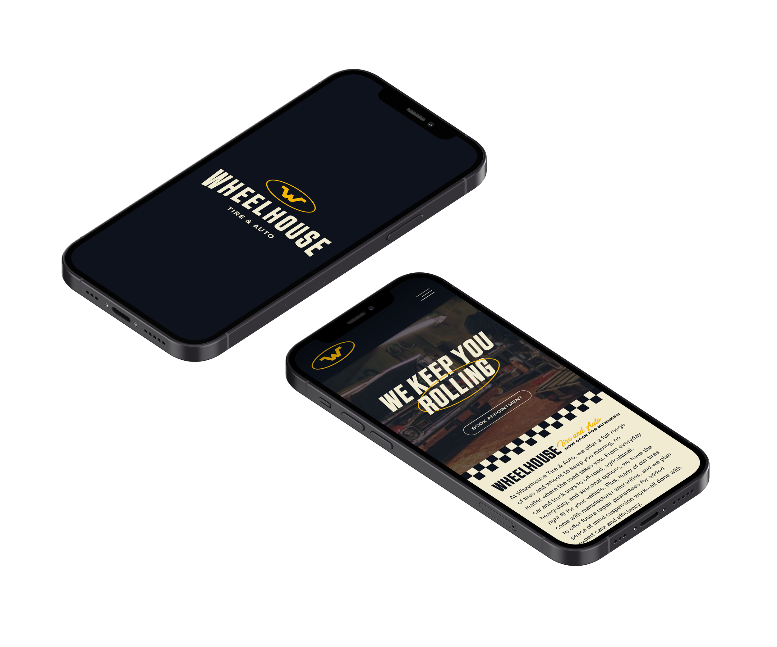
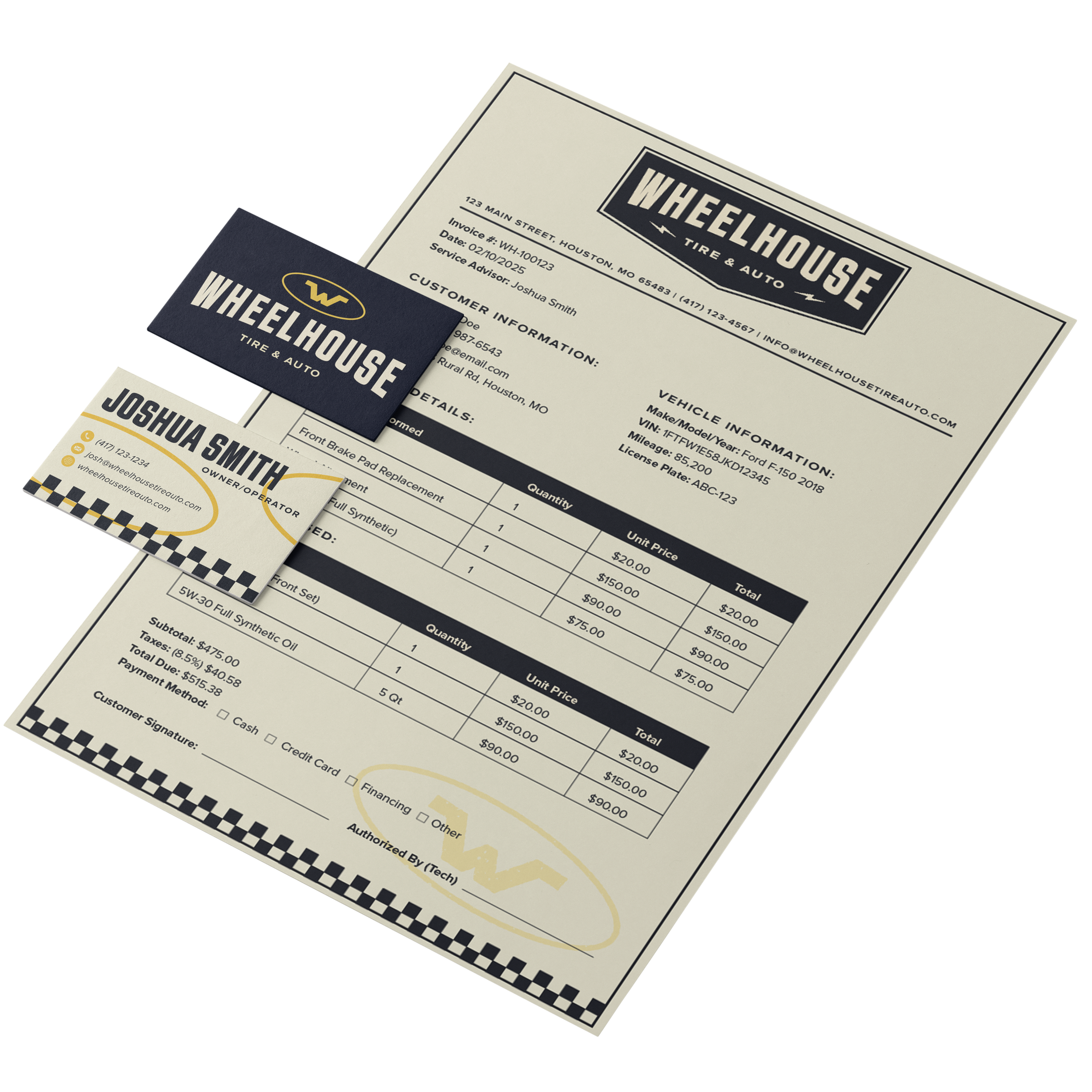
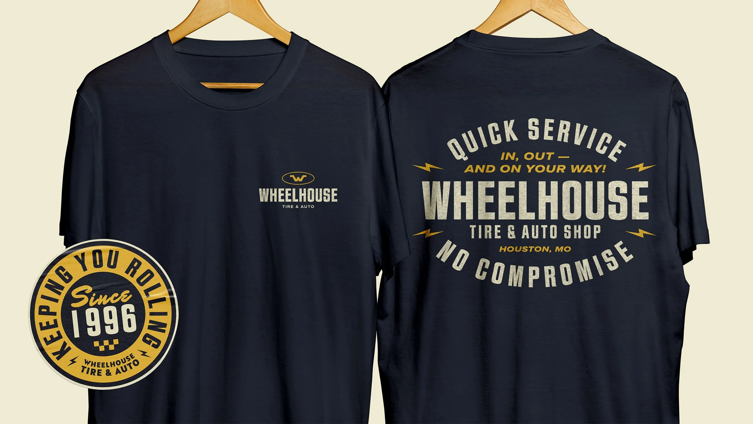
Grounded in the strategic tension between reputation and reinvention, the Wheelhouse identity system was designed to communicate evolution without alienation. The visual language balances strength and restraint, signaling professionalism while remaining approachable to long-time customers.
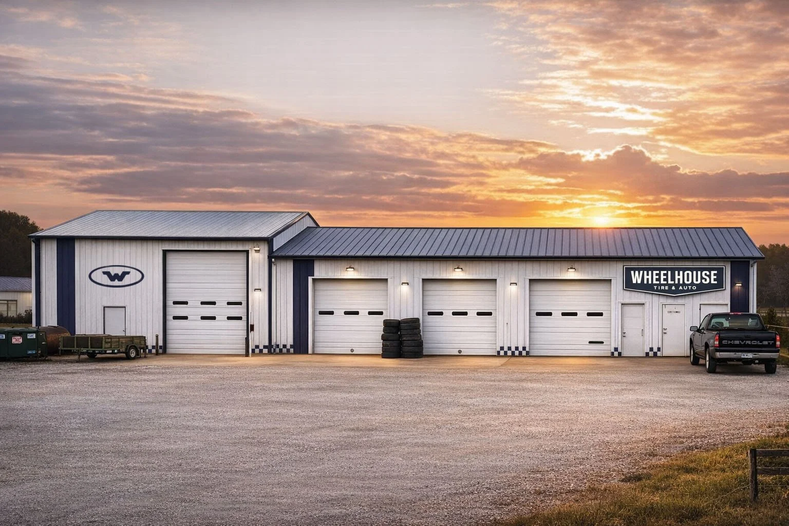
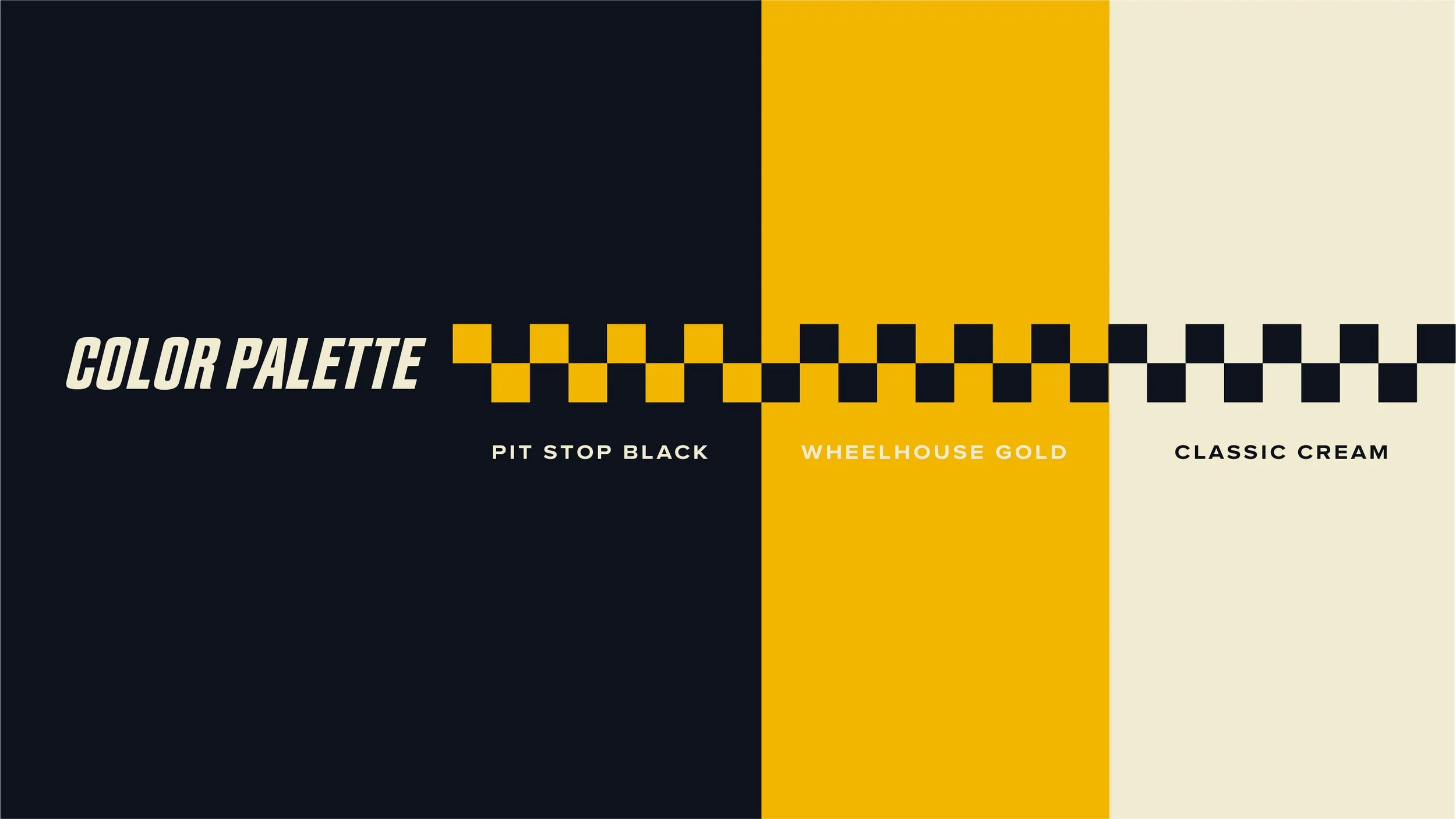
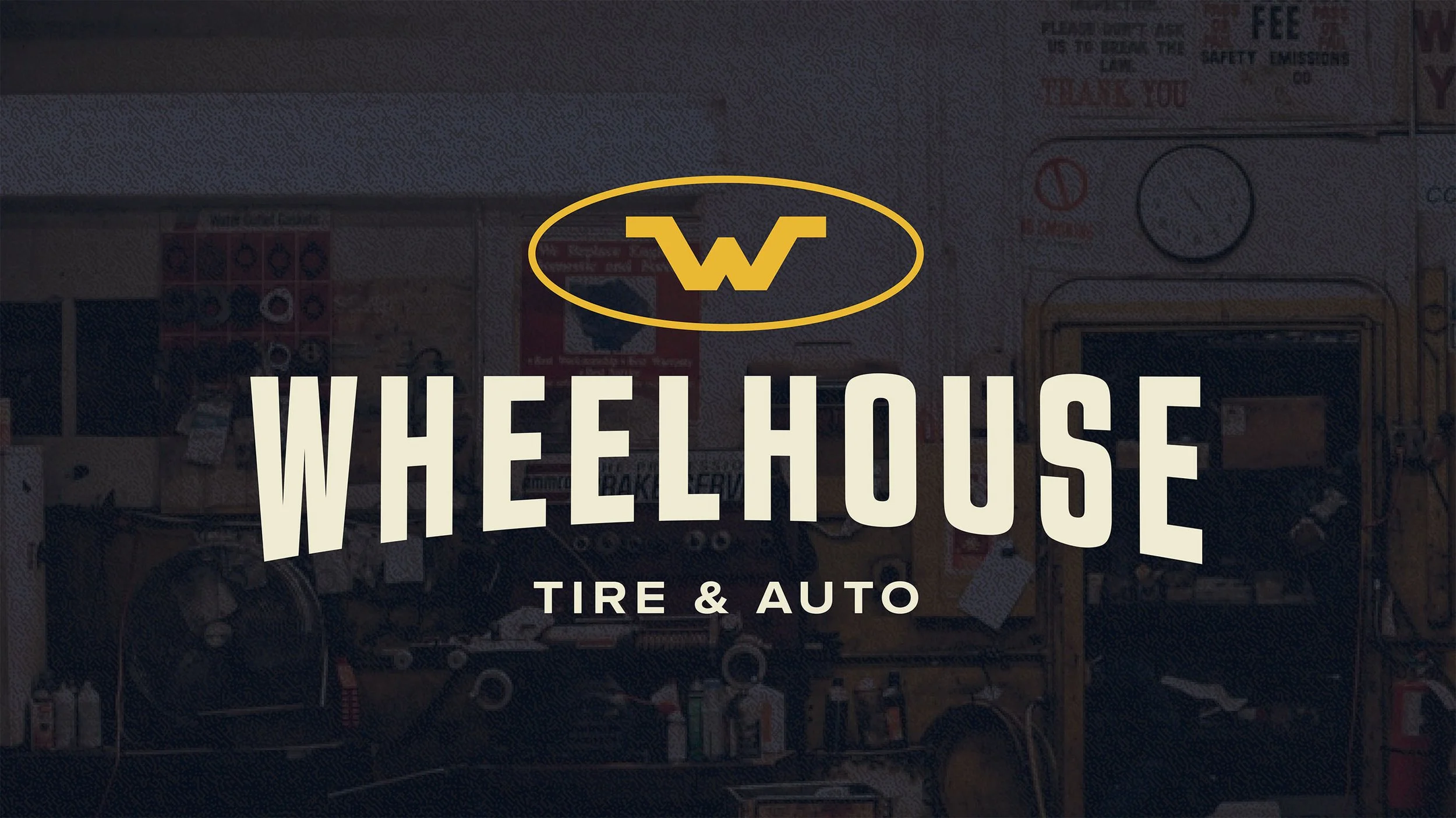
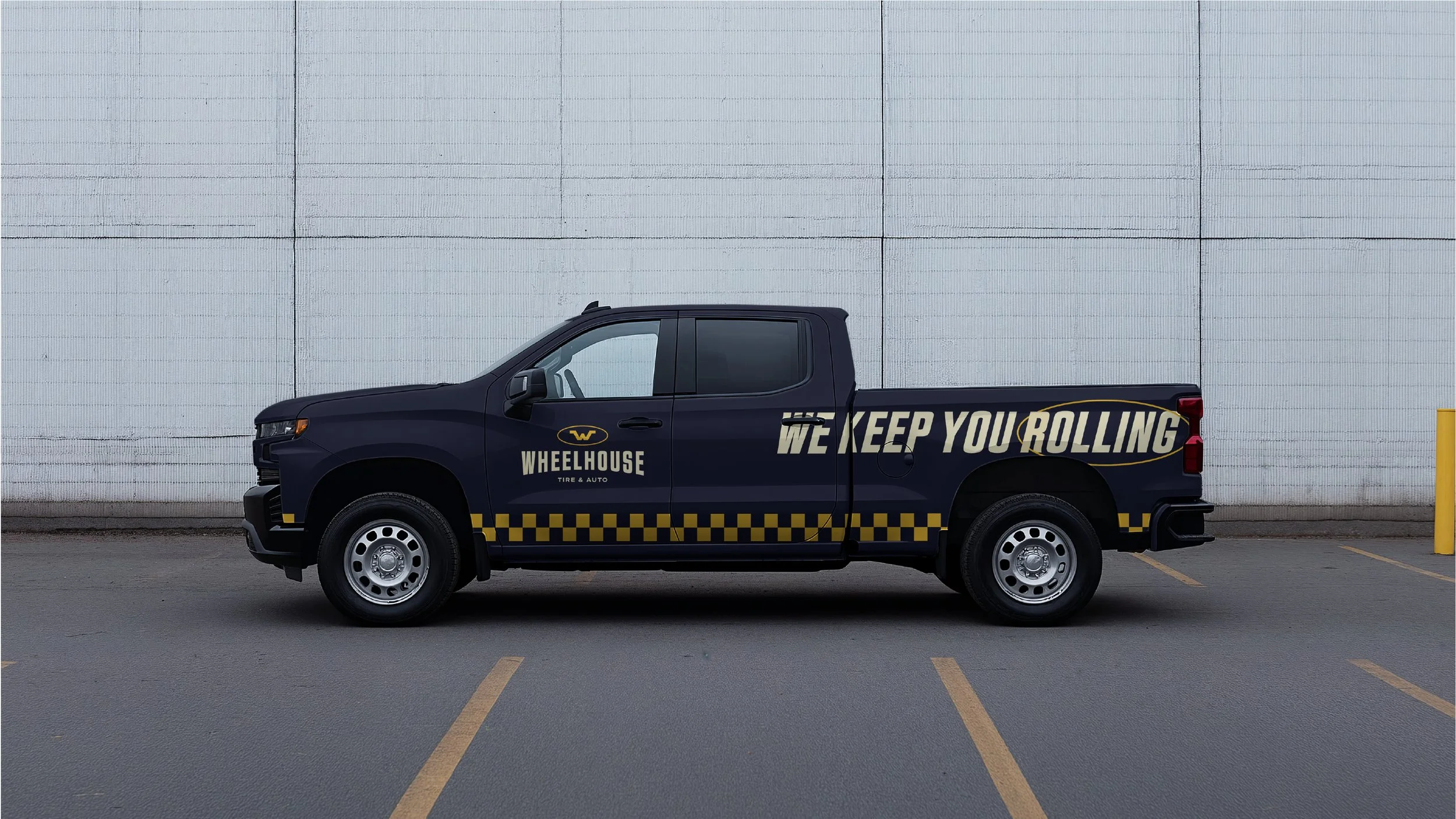
The primary mark carries weight and permanence, supported by disciplined typography and a high-contrast palette engineered for visibility across storefront signage, service bays, uniforms, and digital touchpoints. Every element was built to elevate perception while maintaining the grounded character expected of a trusted local shop.
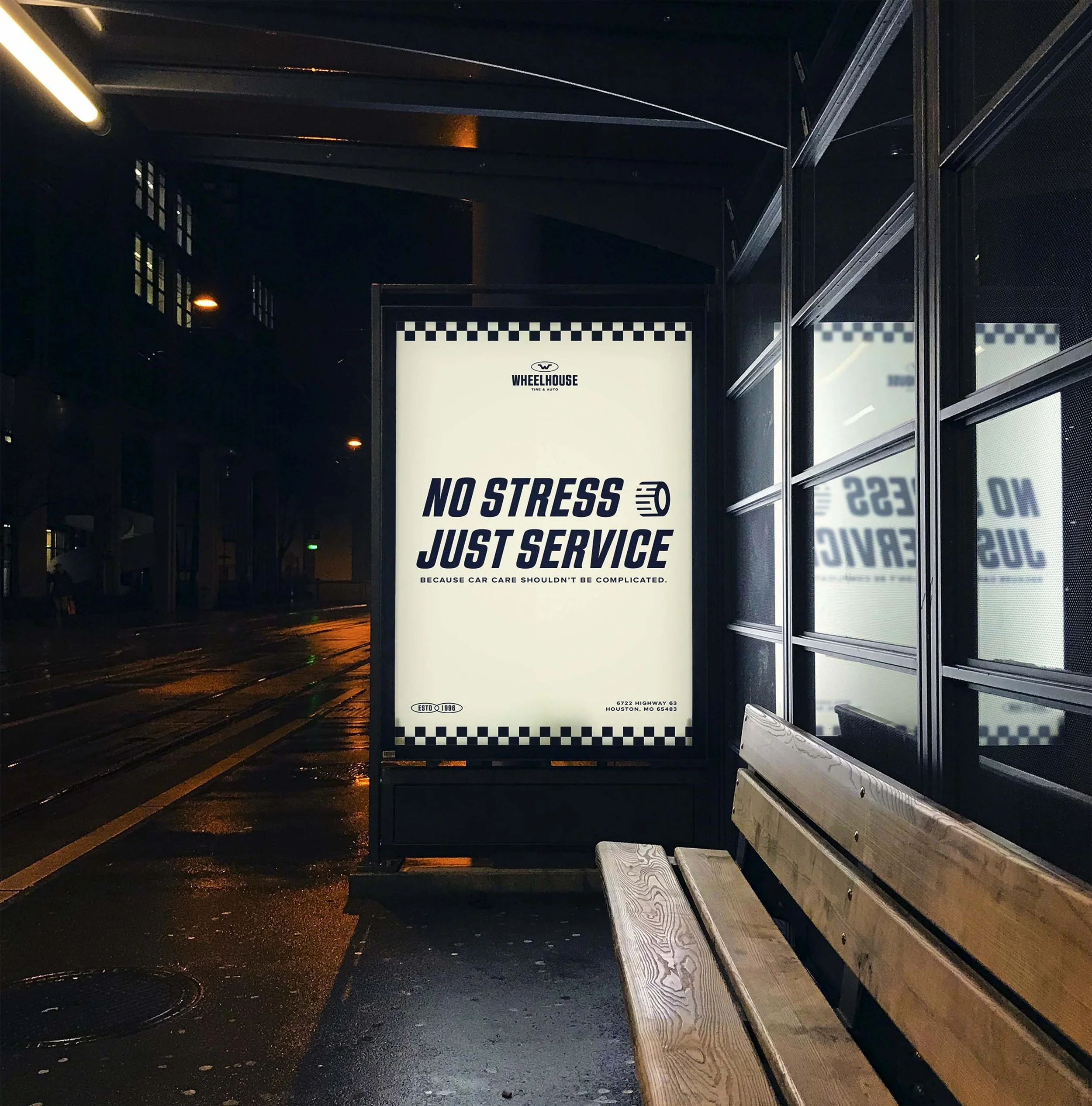
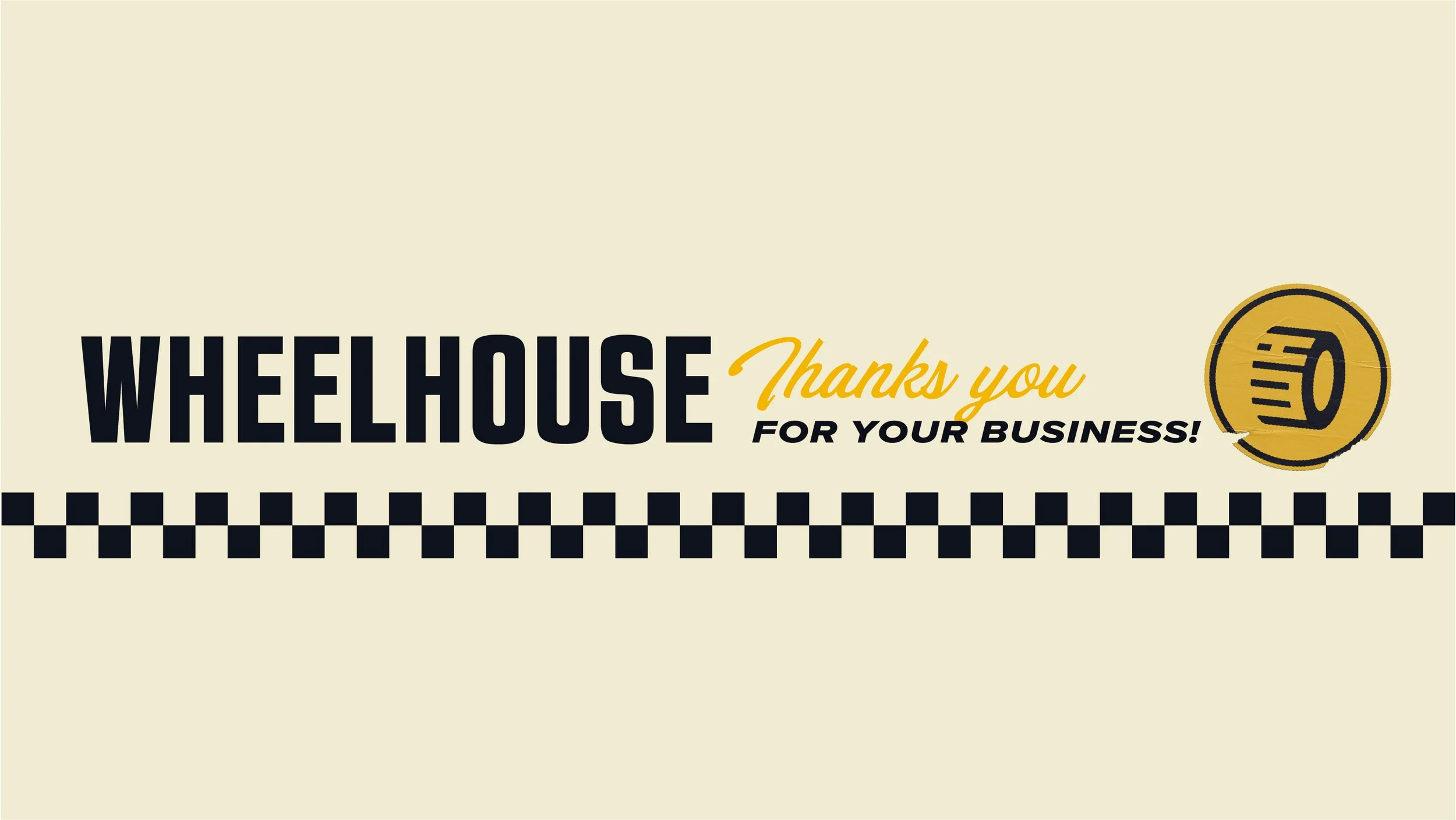
The tone of voice reflects that same balance. Direct. Confident. Community-aware. Wheelhouse speaks with clarity and competence — reinforcing that while ownership has changed, the commitment to service has only strengthened. The result is a rebrand that preserves reputation while establishing a platform for growth.