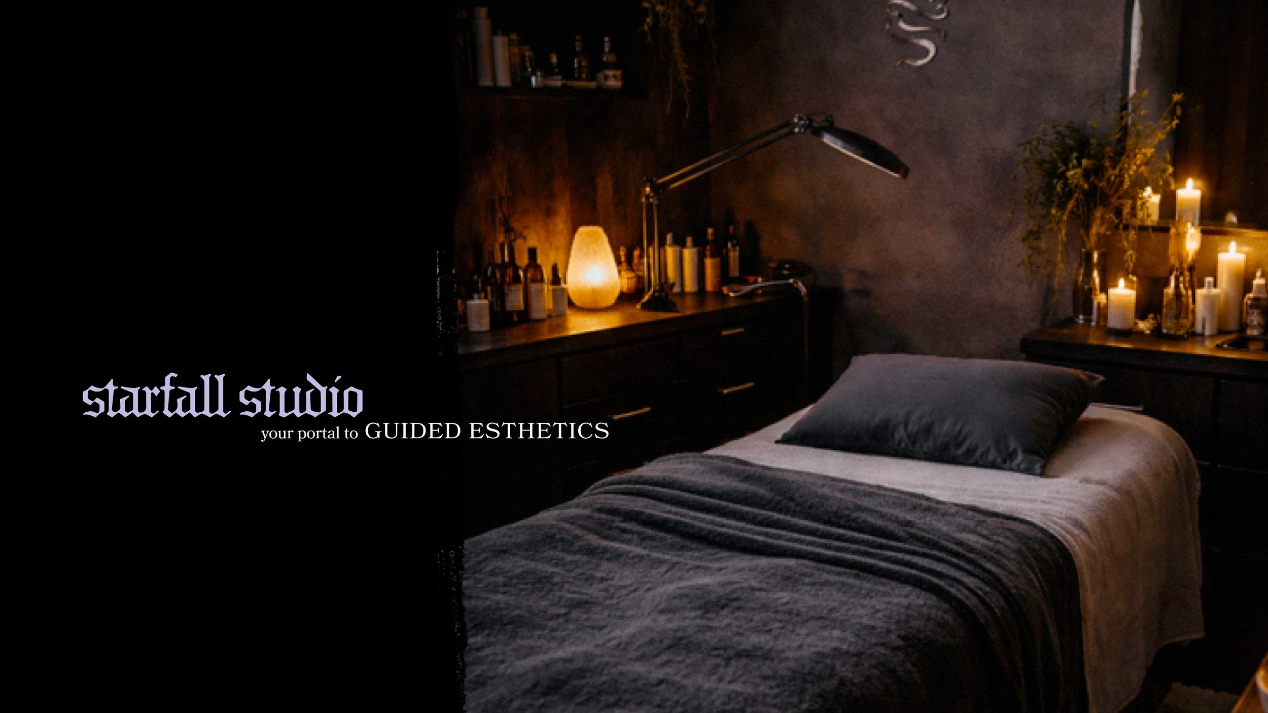
Starfall Studio Between Ritual and Research
Bailey came to us knowing exactly who she was. That's rarer than it sounds. She's a licensed esthetician and cosmetology instructor who takes the science seriously. The formulations, the methods, the results. She also has a personal aesthetic that looks nothing like the industry default. For her, those things were never in conflict. They were the whole picture. Starfall Studio needed to carry both: the precision and education behind every treatment, and the version of Bailey you actually meet when you walk in. Our job was to build an identity that held all of it, without softening any of it.
Industry
Personal Care
Service
Services
Brand Strategy
Brand Identity
Verbal Identity
Print Collateral

The Tension
The esthetics industry has a well-worn visual language. Floral line art, script logos, soft palettes. It reads as approachable and clean, and it makes sense for the category. It also makes everyone look the same.
Bailey wasn't interested in looking like everyone else. She came with a clear vision: dark, atmospheric, rooted in ritual. And a practice built on science, education, and client choice. The challenge was designing something that honored both without creating confusion around her credibility.
The esthetics client often associates polish with safety and trust. So how do you build a brand that feels bold and genuinely personal while still communicating real expertise? That was the tension. And it made for a more interesting problem to solve.
The Expression
The Starfall Studio identity draws inspiration from old-school movie title cards and block printing traditions. Bold, graphic, and typographically commanding. The wordmark is set in a gothic display face with real presence and weight. A serpentine S monogram gives the brand a distinctive mark that feels personal to Bailey and unlike anything else in the esthetics space.
The star mark came directly from her. She came in with a specific request: a falling star. Rather than fitting it into a predictable form, we built the identity around it. It became a visual anchor that feels celestial and editorial at once, and it's entirely hers.
The palette is deep black and charcoal with soft lavender accents. Atmospheric. Candlelit, almost. Business cards, service menus, print collateral throughout. All of it holds that same intentionality. The verbal identity matches the visual: science-based esthetics guided by intention, education, and choice. No fluff. Just a practitioner who knows exactly what she's doing, and a brand built to prove it.