
Sumners-Schwartz Law Between Authority and Approachability

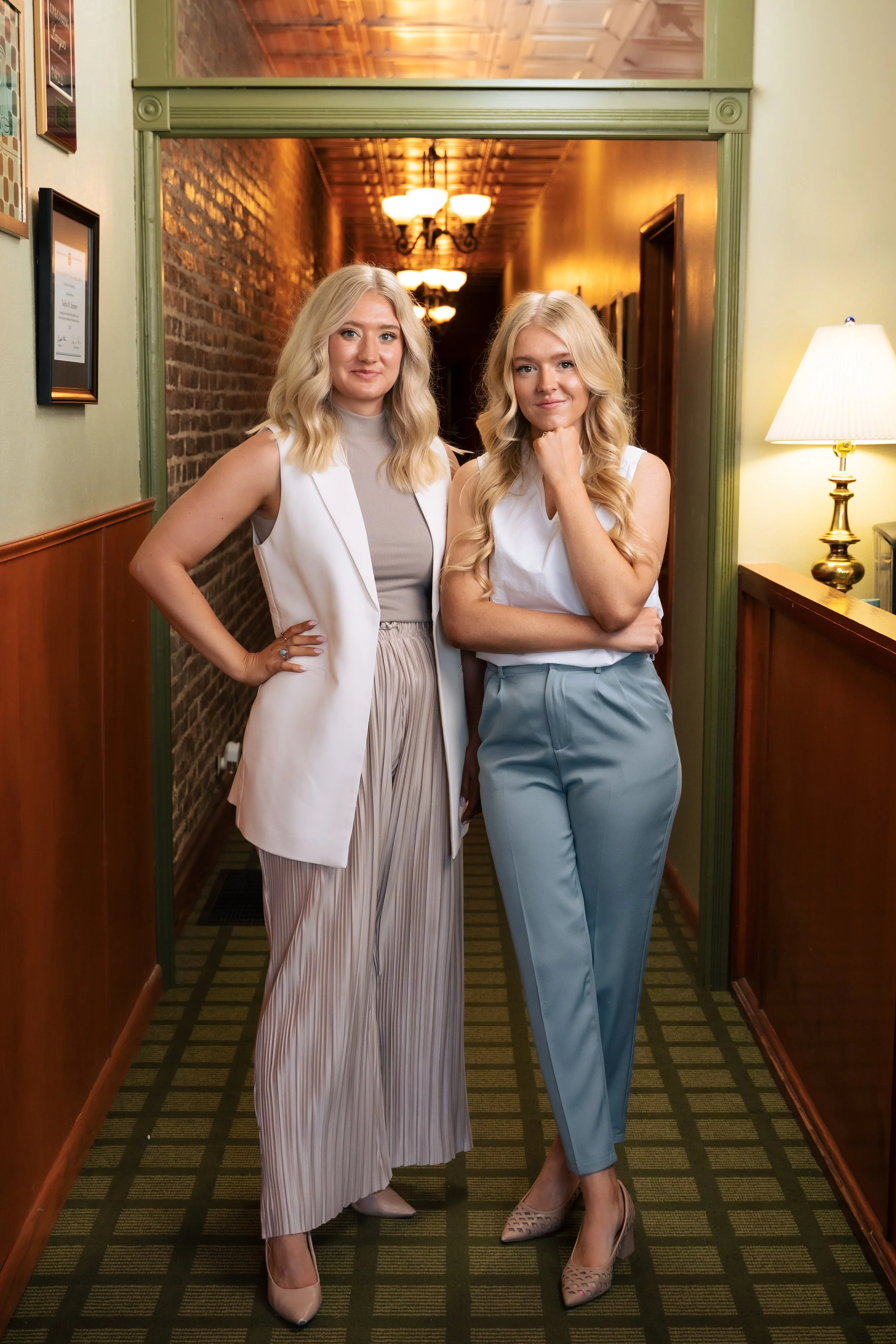
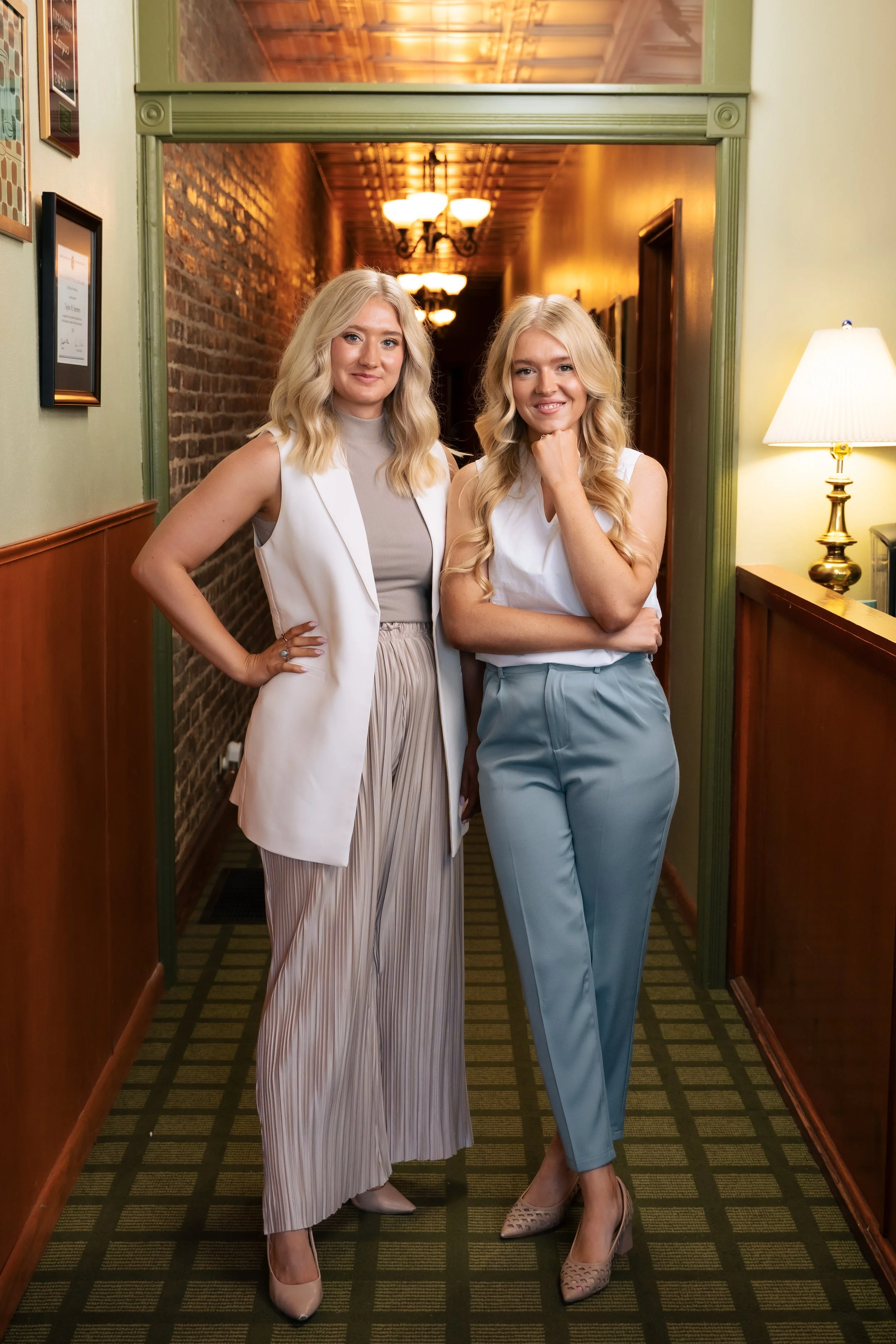
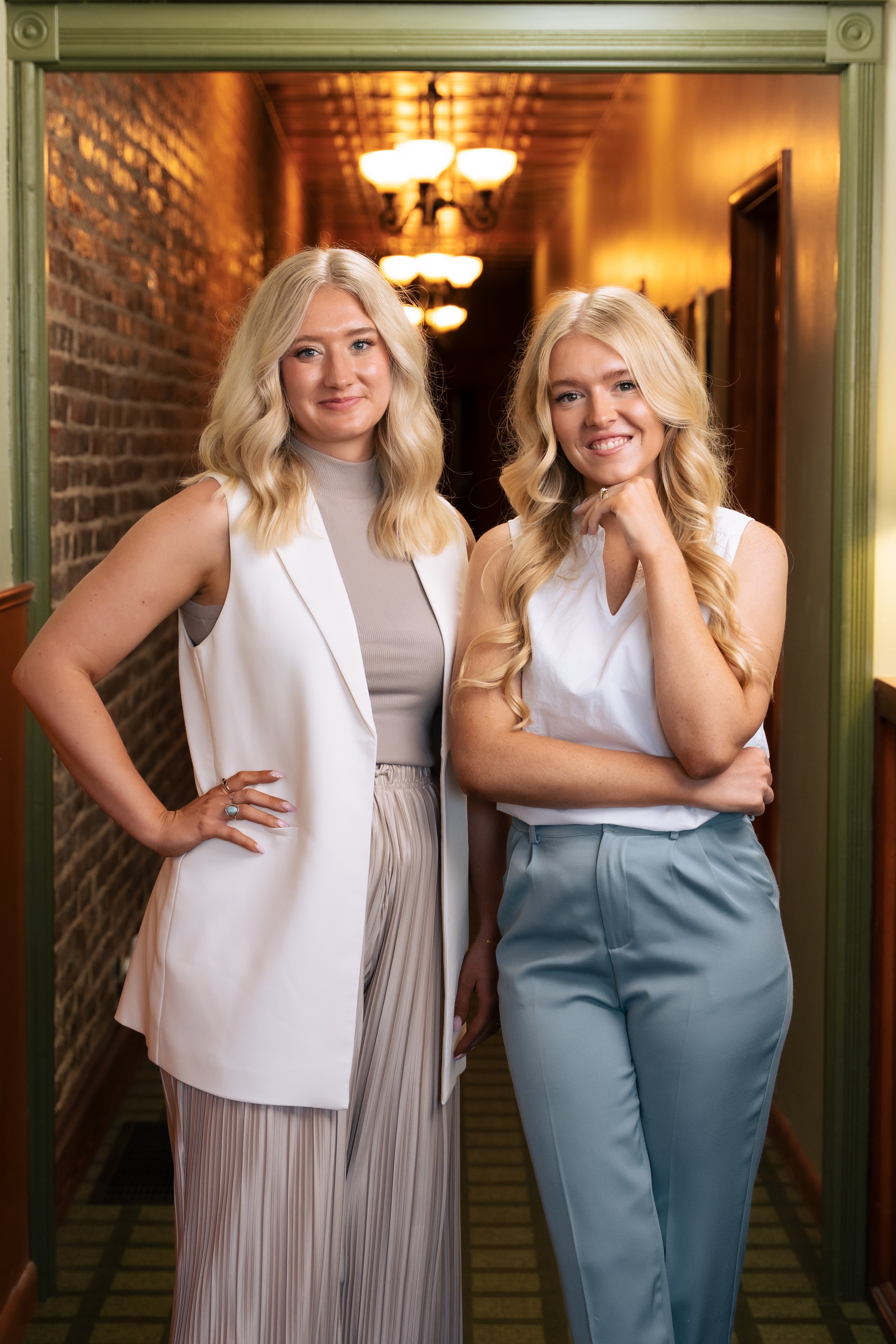
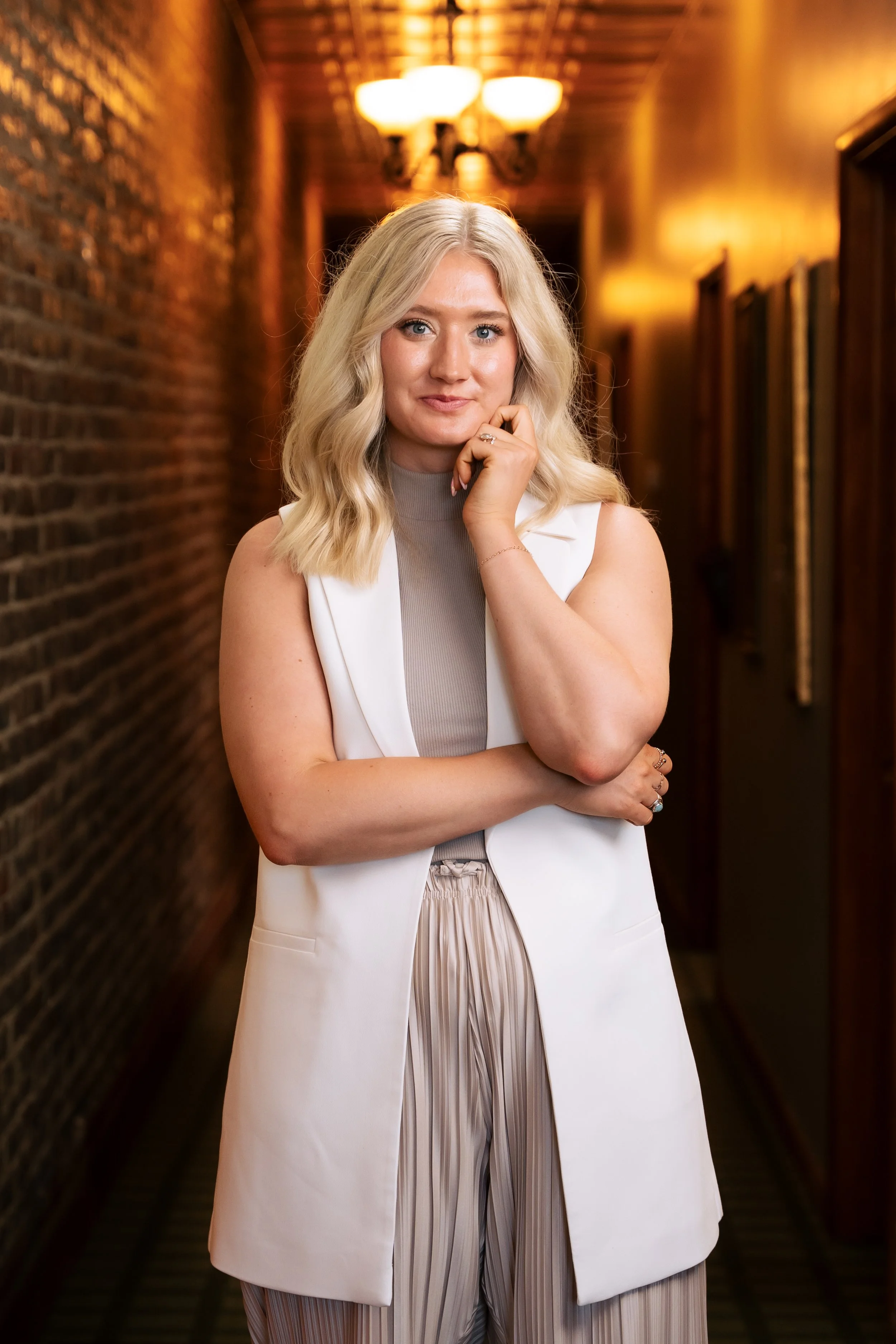
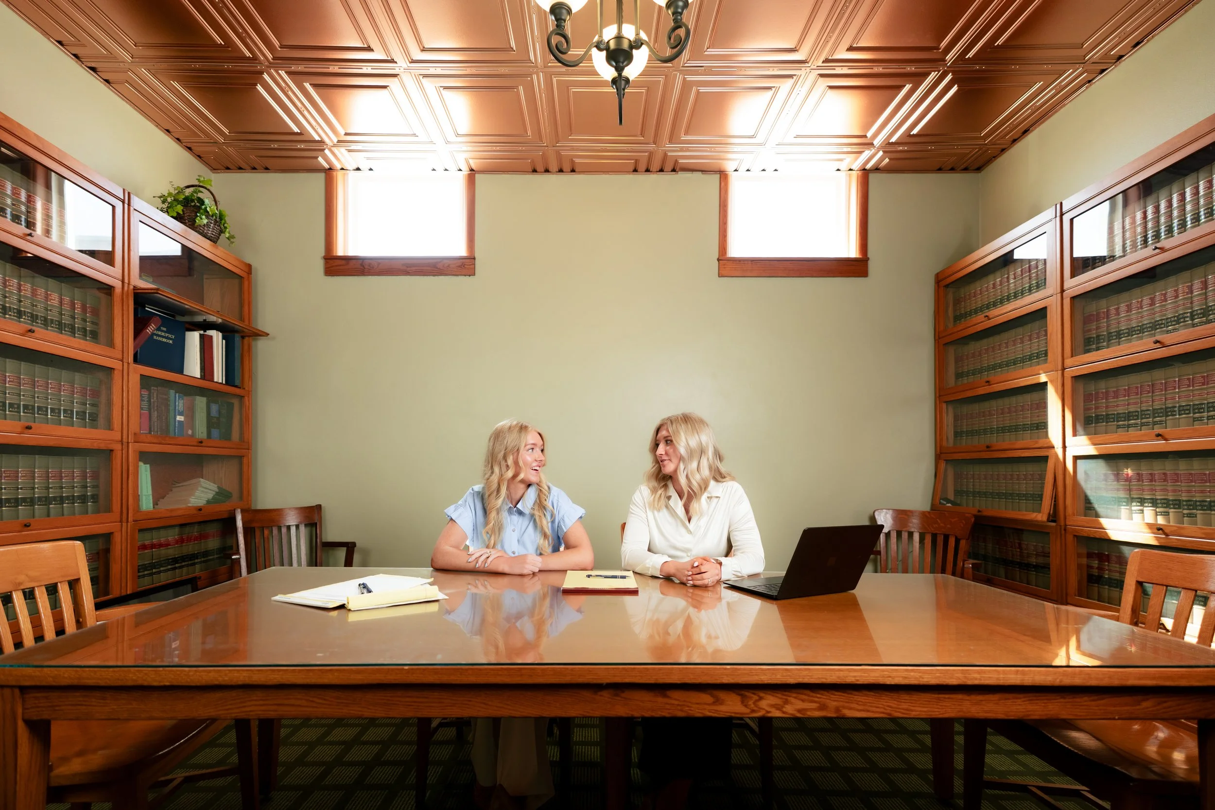
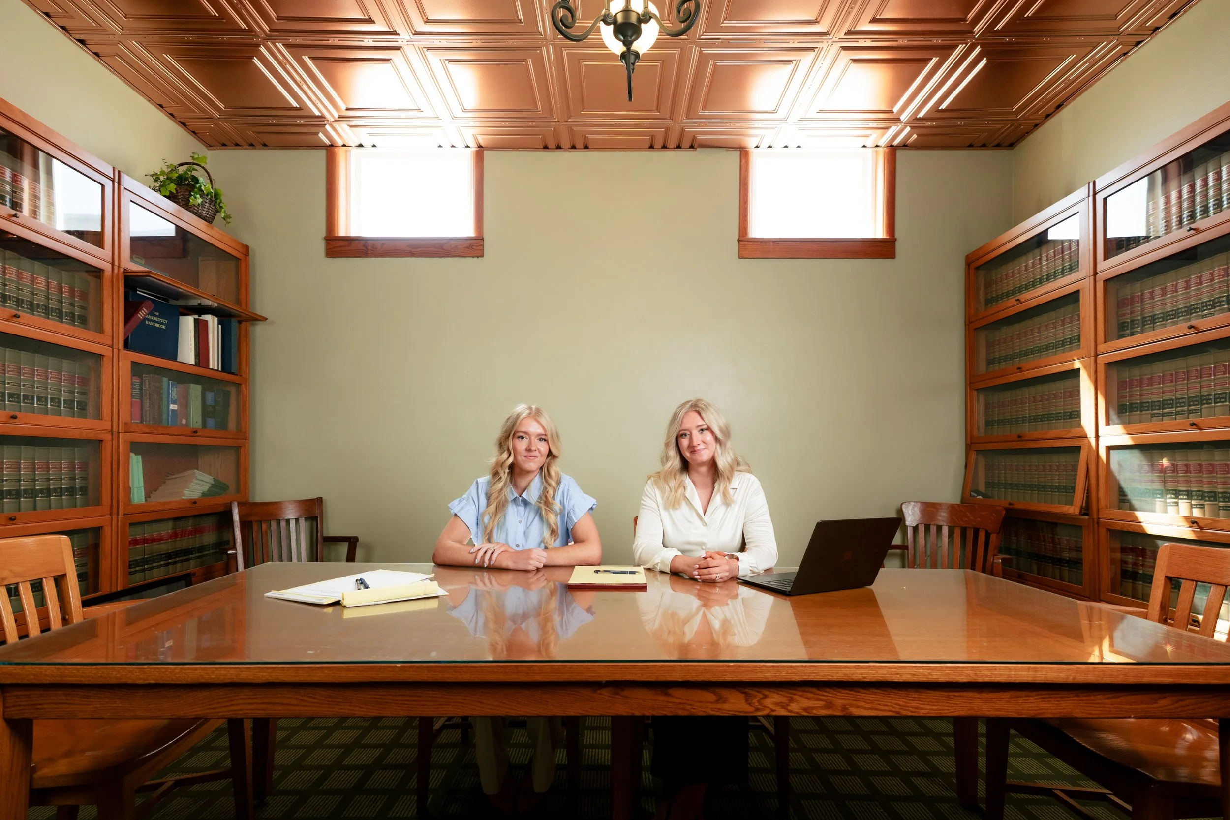
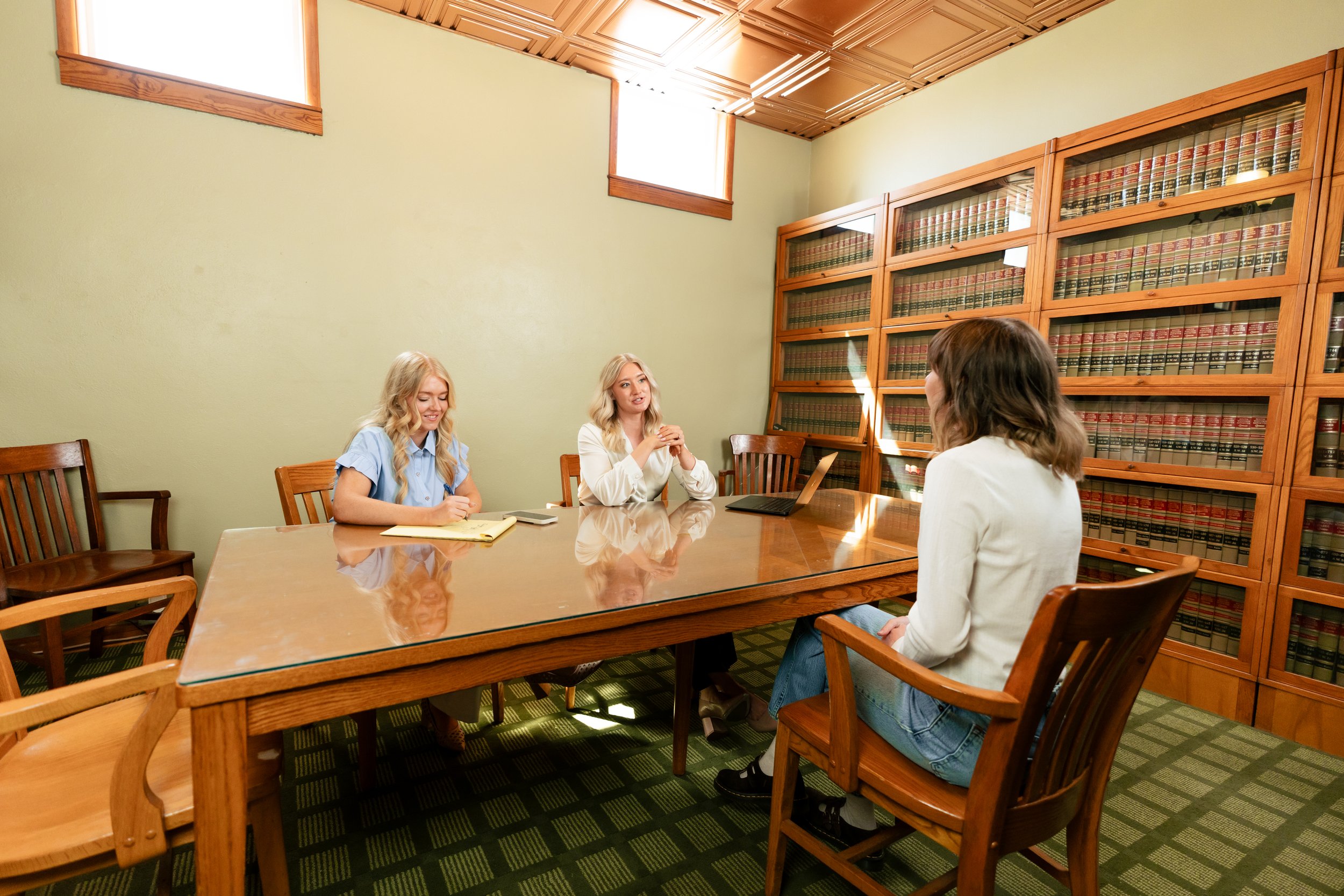
When Taylon Sumners-Schwartz set out to establish Sumners-Schwartz Law, she wasn’t just opening a new law firm, she was building a practice that reflected who she is as an attorney and as a person. Rooted in Mt. Vernon, Missouri, the firm was created with the intention of serving the local community with clarity, integrity, and compassion.
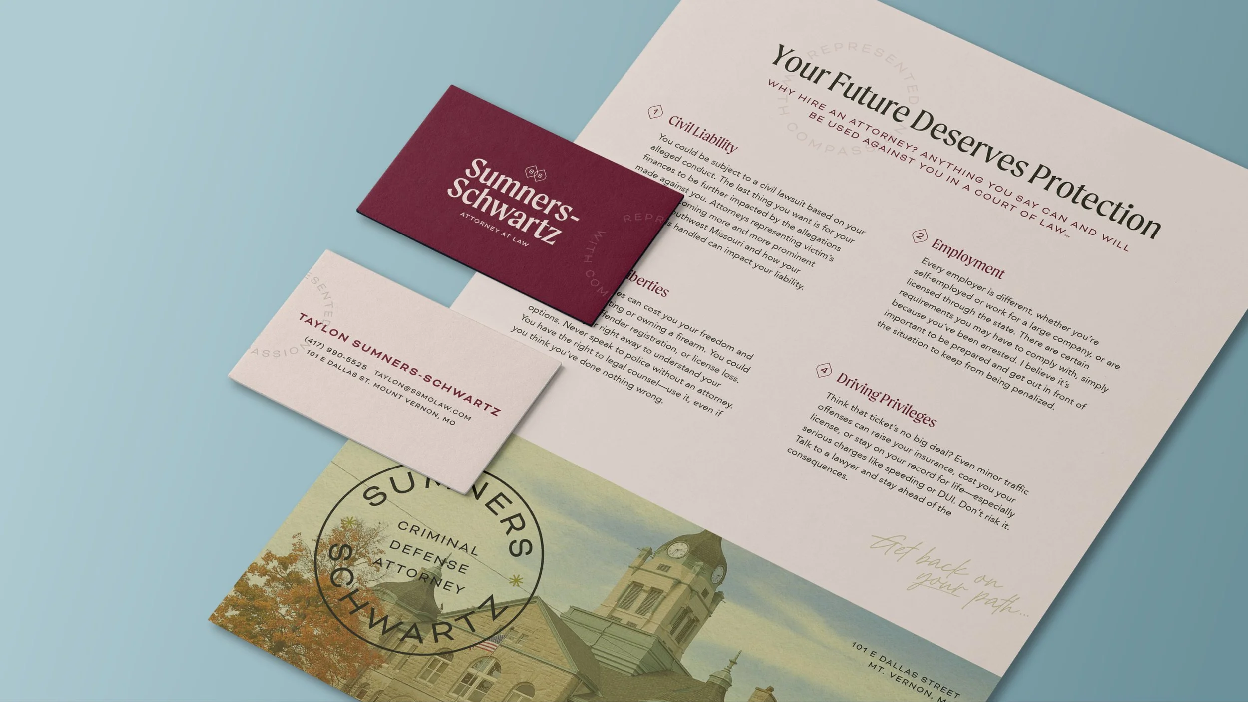
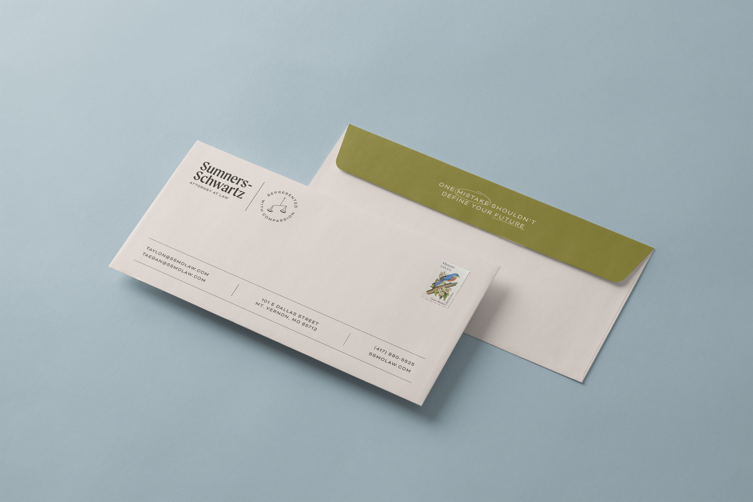
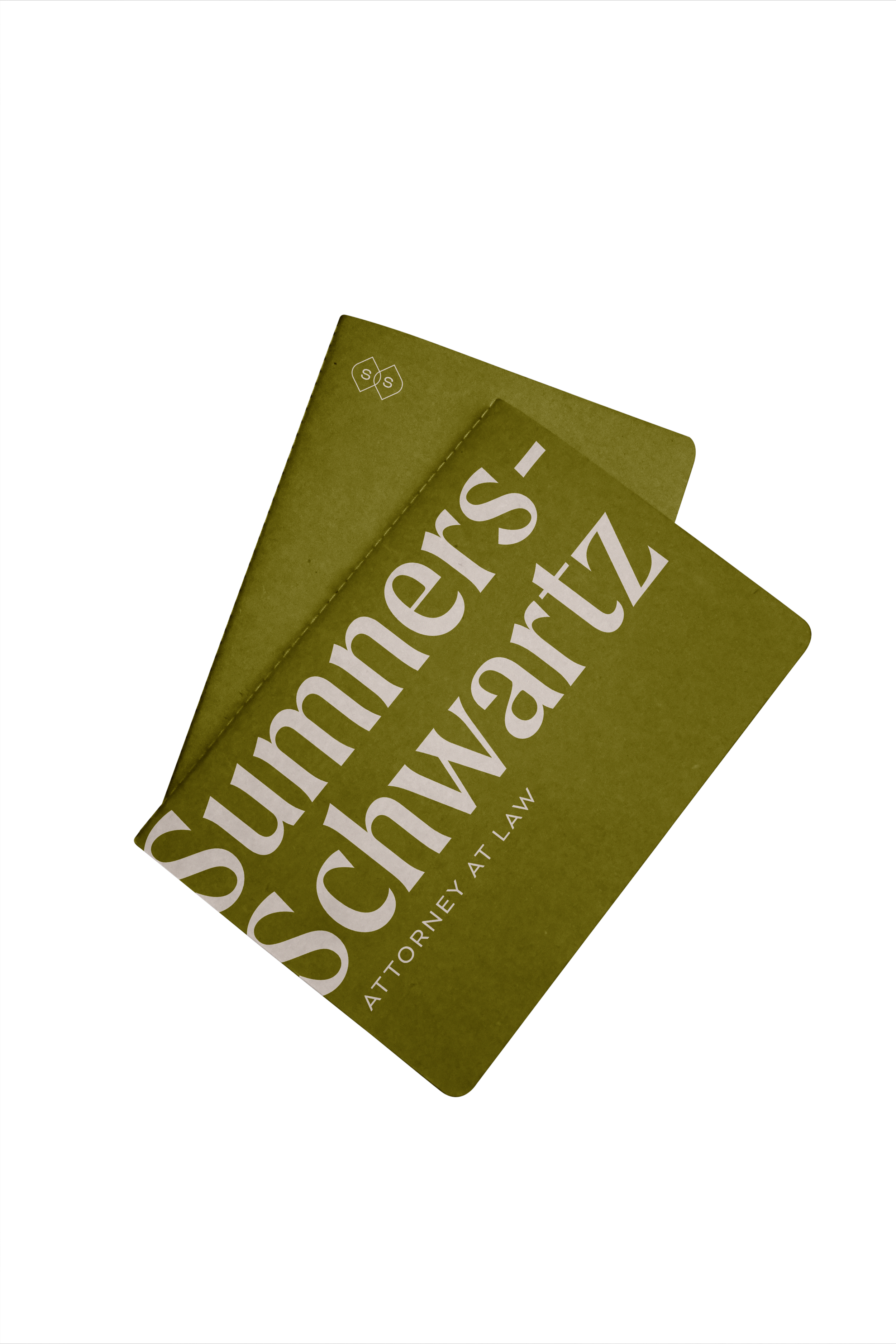
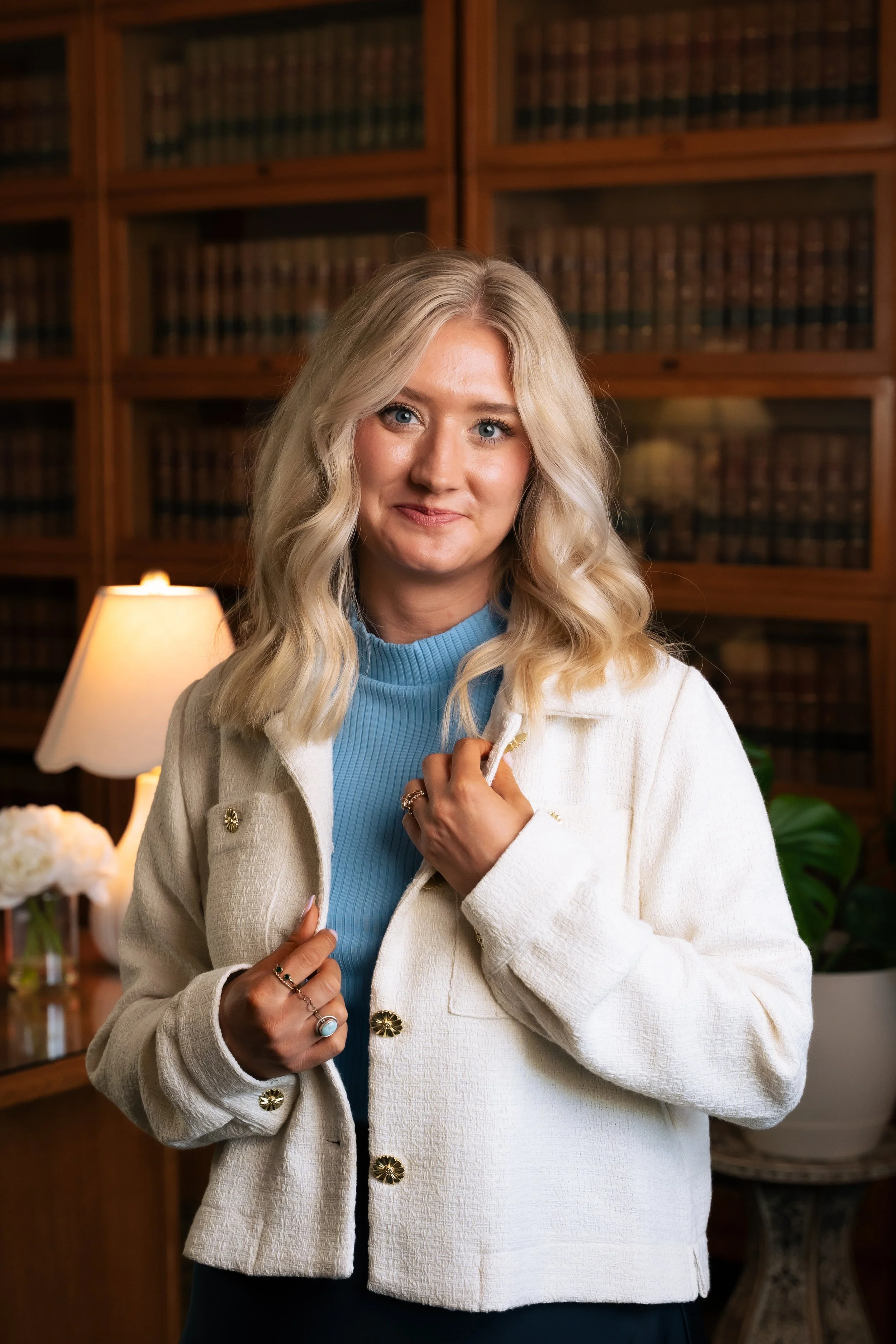
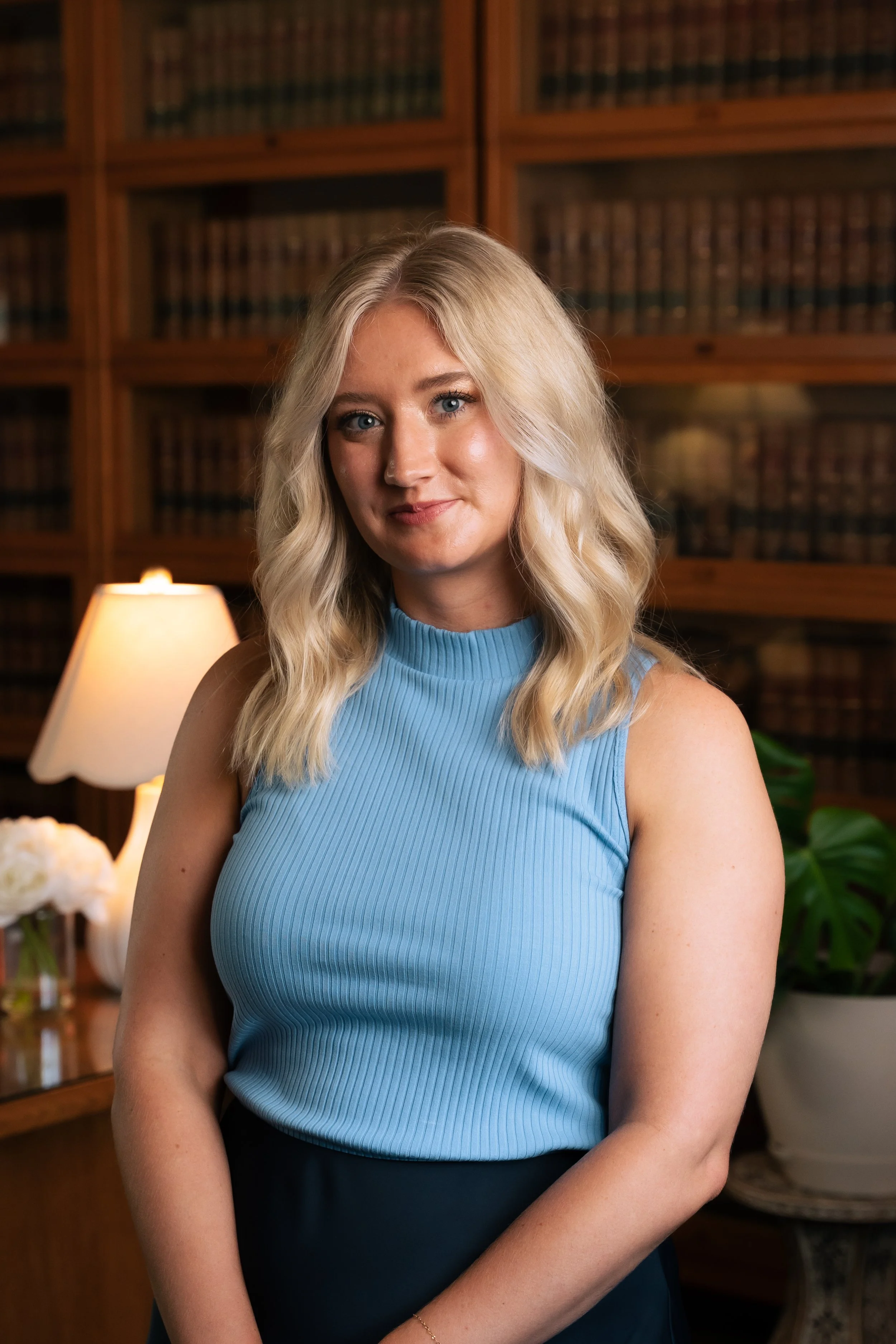
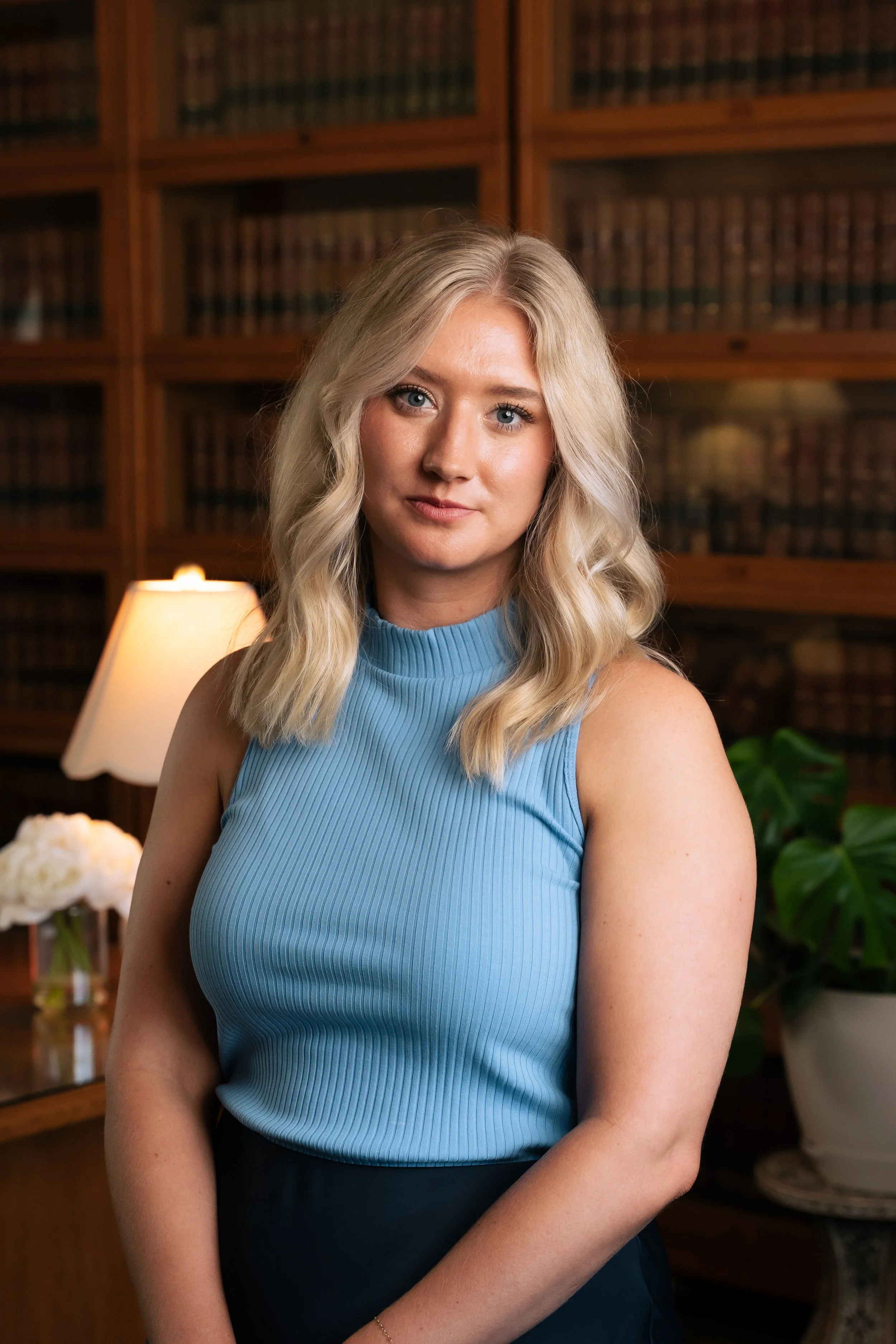
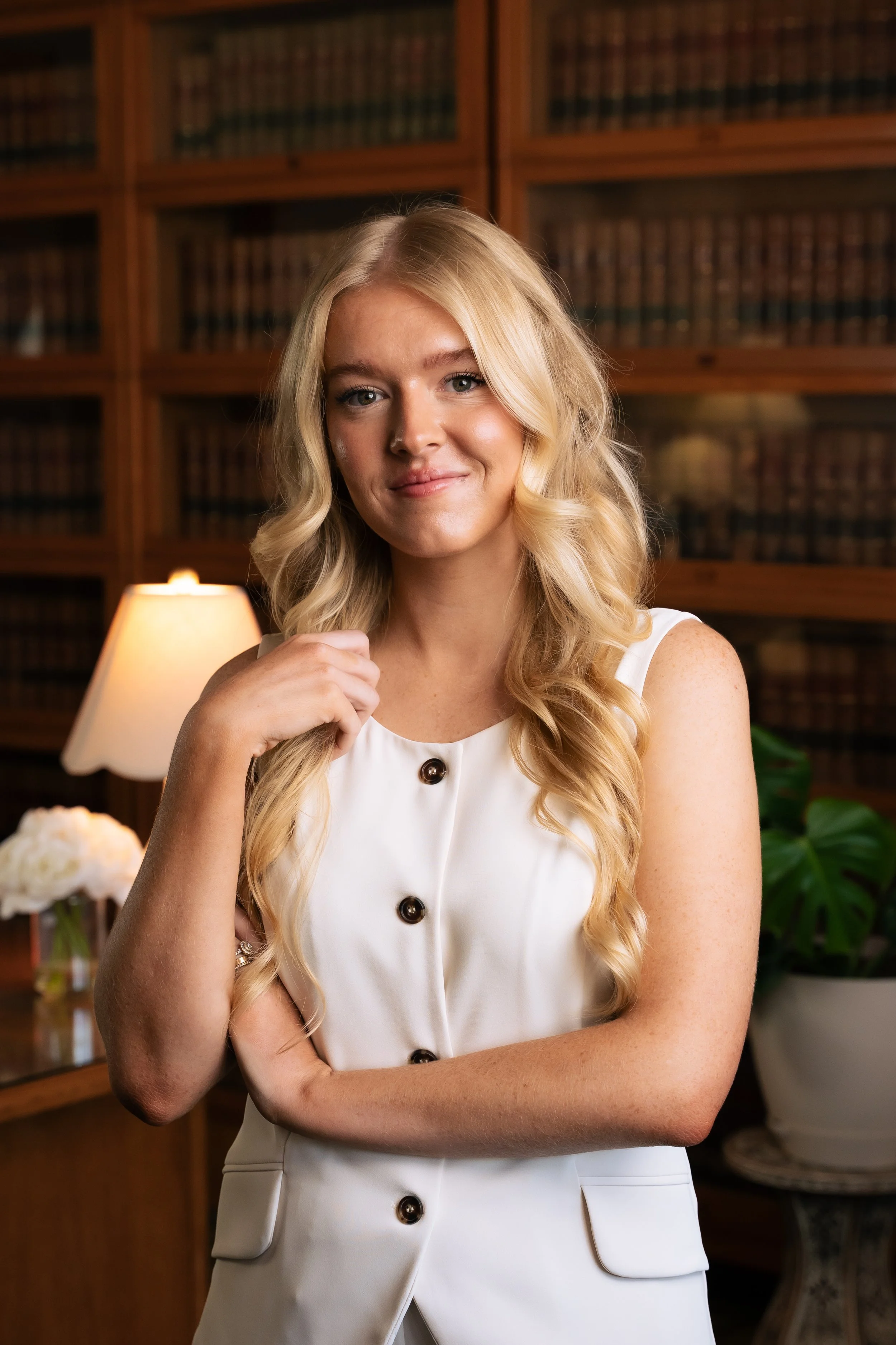
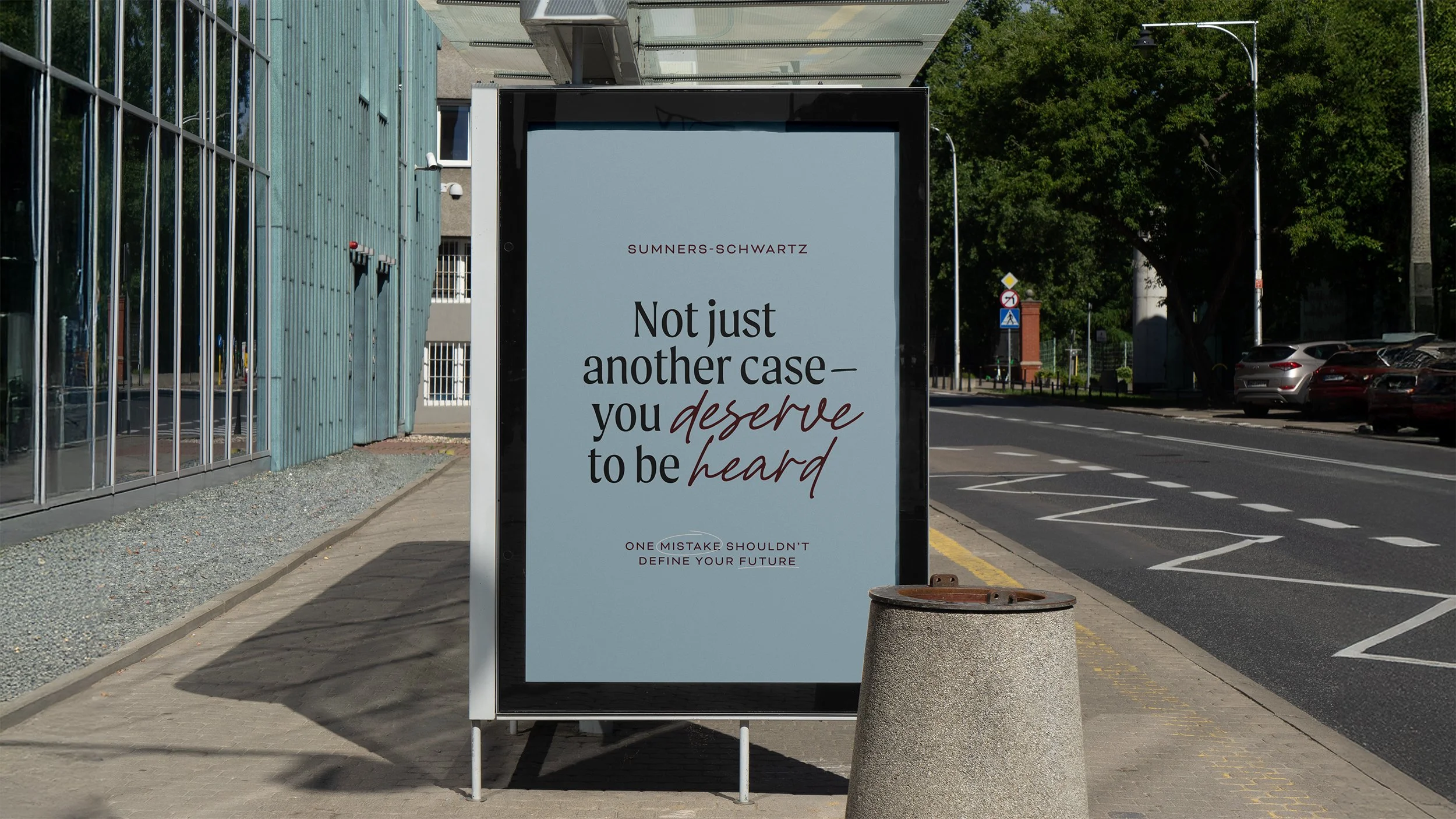
Criminal defense is a field where clients often arrive carrying fear, uncertainty, or shame. Taylon wanted her firm to feel different from the moment someone encountered it. The brand needed to communicate strength and professionalism while still feeling human and approachable which is a reflection of the way she treats the people who place their trust in her.
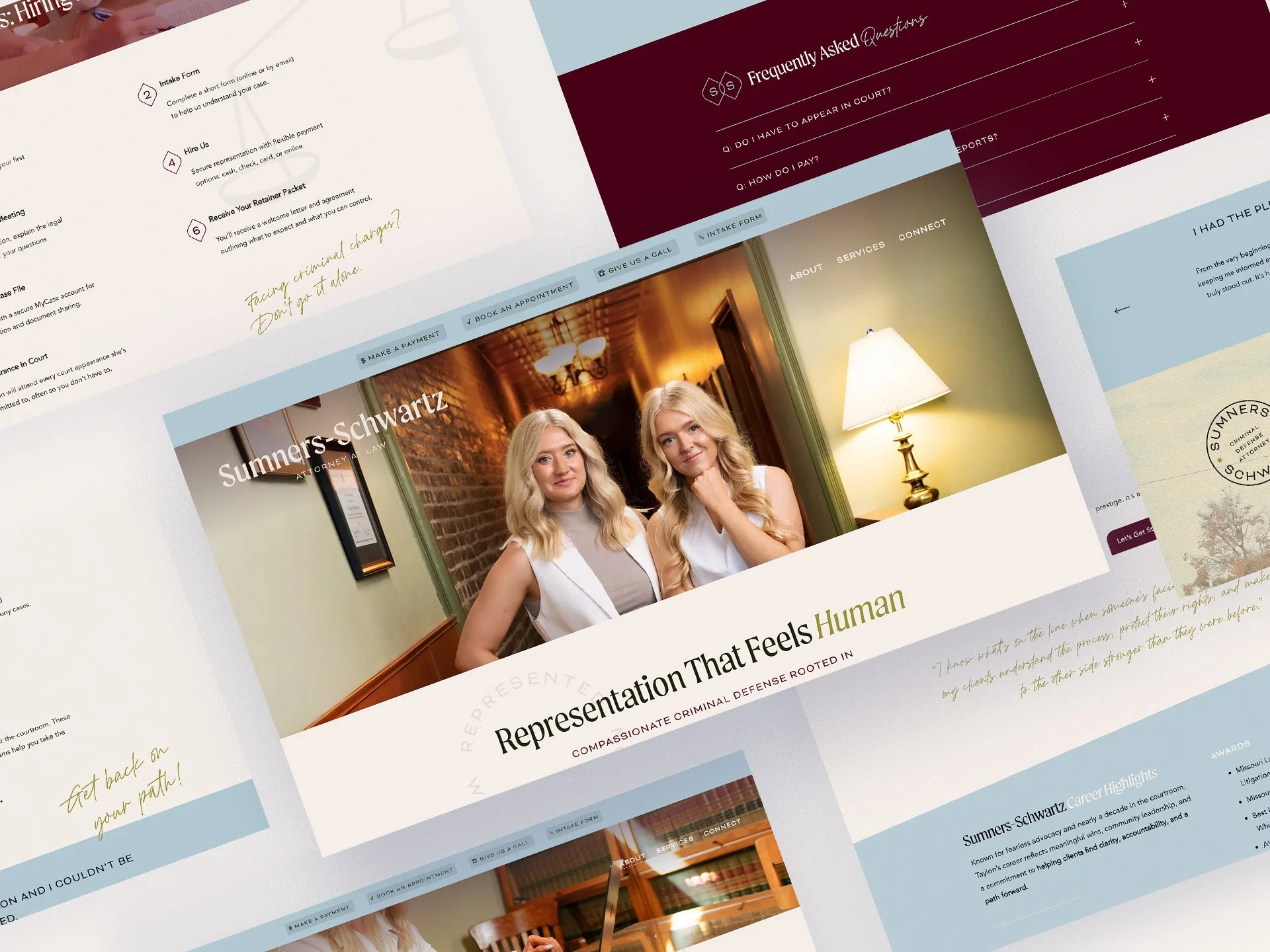
Our role was to translate those values into a visual identity and digital presence that would position the firm with credibility while still feeling welcoming to those navigating some of the most difficult moments of their lives.
Industry
Legal Services
Services
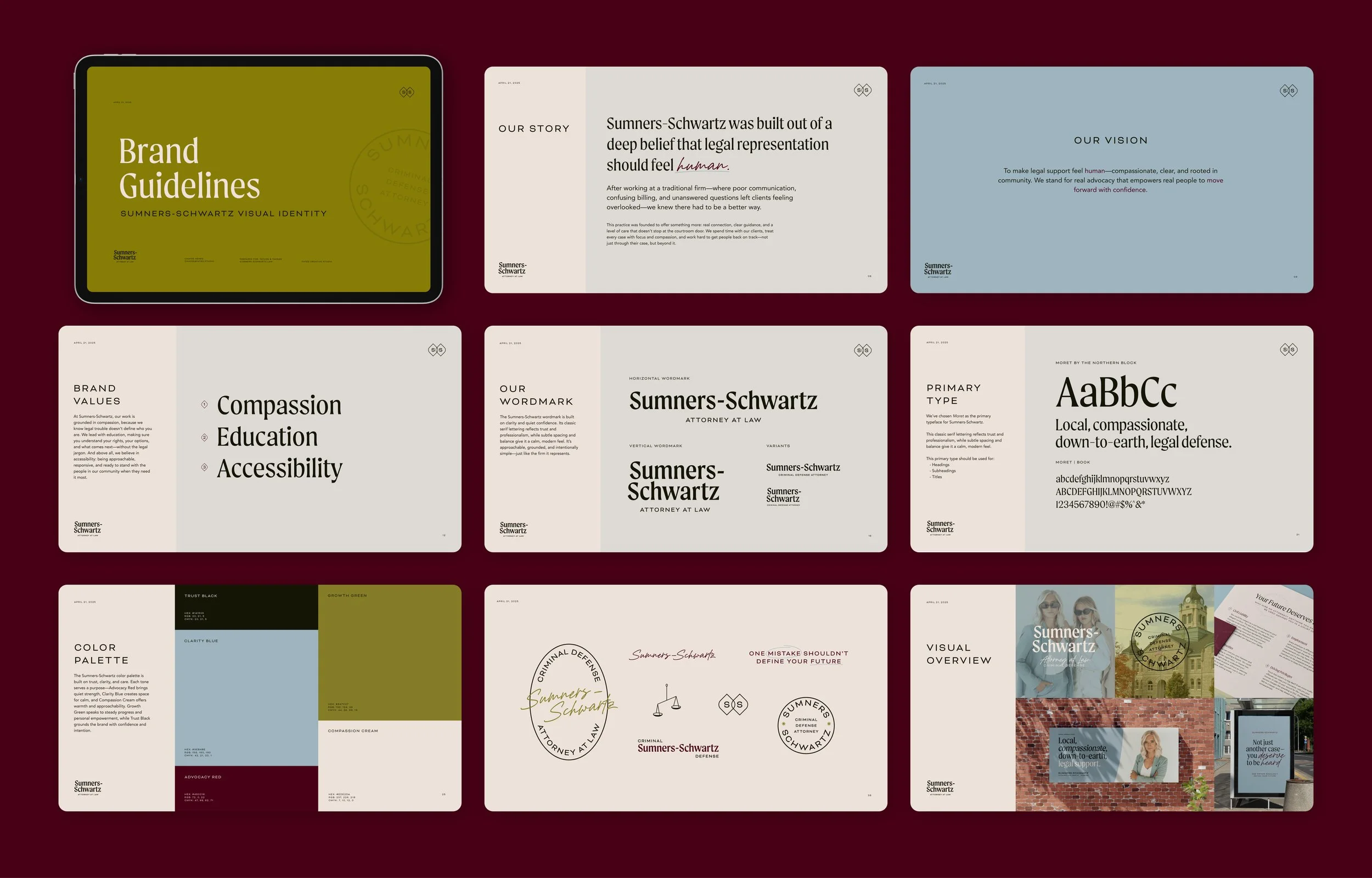
Brand Strategy
Brand Identity
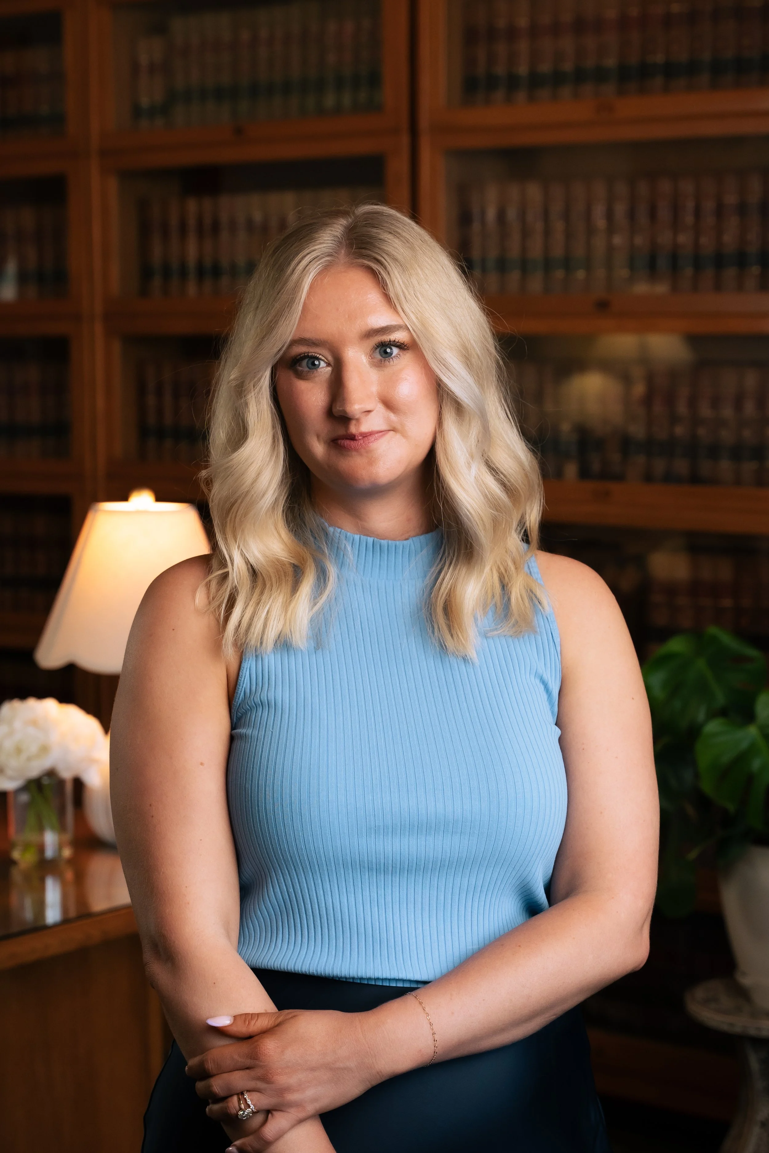
Brand Photography
Verbal Identity
Copywriting
Website
Live Site

The Tension
The legal industry carries a long-established visual language of one built around dark palettes, heavy typography, and rigid, masculine aesthetics meant to signal authority. While these conventions exist for a reason, we approached the brand for Sumners-Schwartz with a more thoughtful lens.
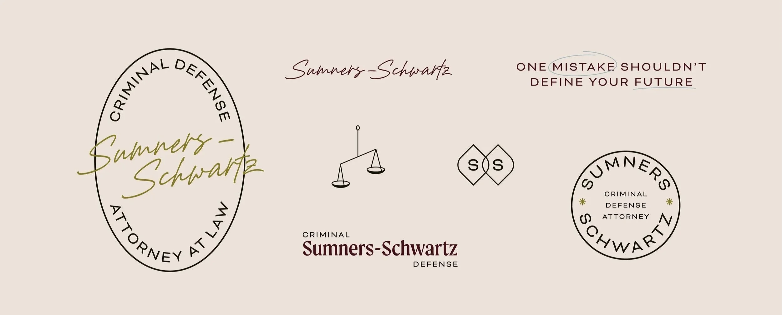
Rather than rejecting the traditions of law entirely, we chose to pay homage to them while refining the way they appear. The result is a brand that still communicates professionalism and credibility, but in a way that feels more modern, approachable, and human.
This balance was especially important given Taylon’s position in the legal world. As a young female attorney, perception and authority can carry additional weight in professional settings. Leaning too far into feminine design language risked softening the brand in ways that might unintentionally undermine the strength and capability she brings to her work. At the same time, creating an identity that felt overly masculine would fail to represent her authentically.
The strategy became one of equilibrium. Every design decision, from typography to color, layout to tone, was guided by the goal of expressing Taylon’s intelligence, accomplishments, and strength while maintaining the warmth and approachability that define her practice.

The Expression
The final brand for Sumners-Schwartz Law reflects the balance at the heart of the firm itself: confidence paired with compassion, professionalism paired with humanity.
Through a carefully crafted visual identity and a website designed for clarity and ease, the firm now presents itself with quiet authority while remaining deeply accessible to the community it serves. Visitors encounter a practice that feels capable and steady, but never intimidating. It’s a place where people can seek guidance without feeling judged or diminished.
For Taylon, the brand represents more than a law firm. It represents the kind of advocate she intends to be: intelligent, disciplined, and unwavering in her commitment to the people who rely on her.


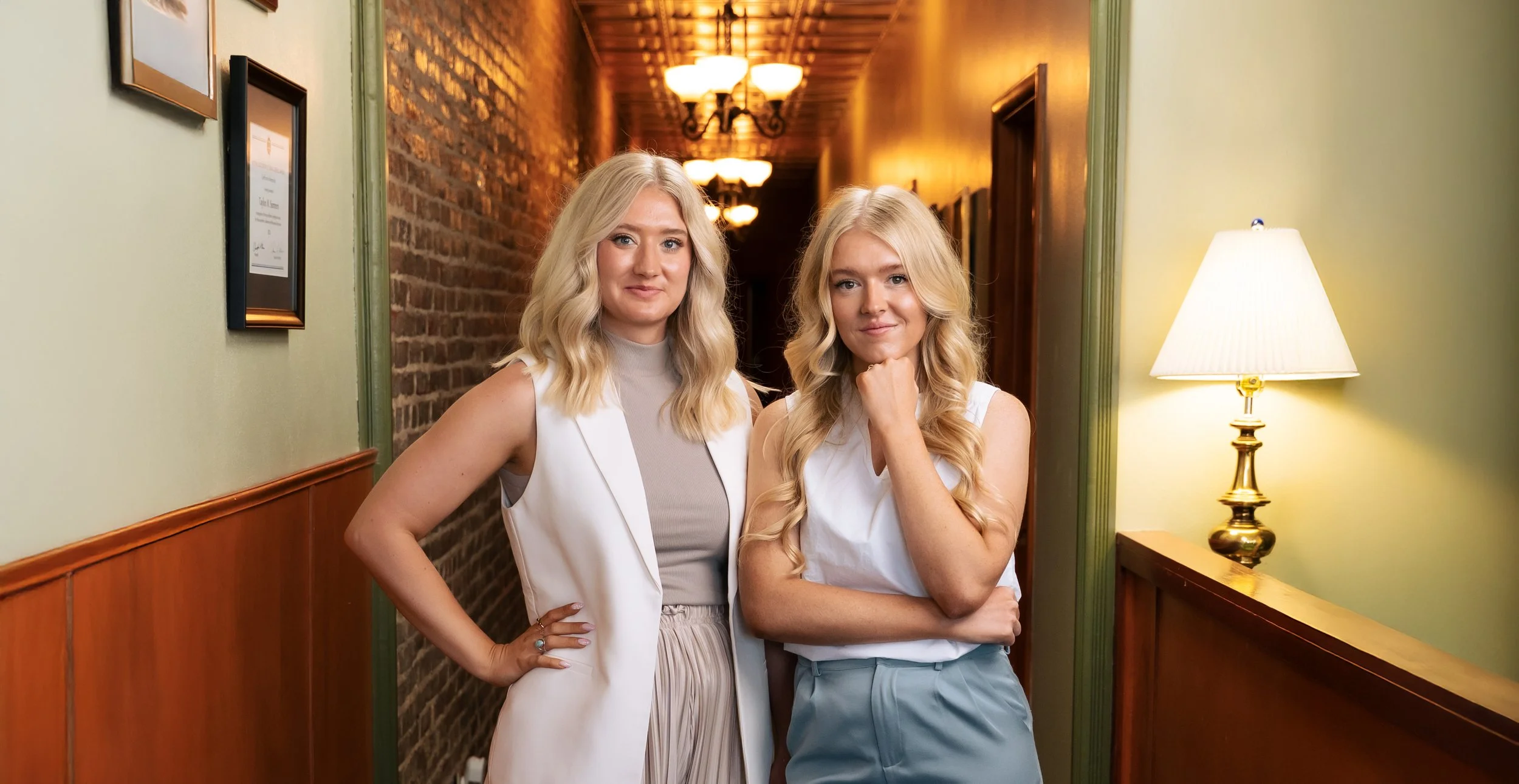
You guys have been amazing and I will 10/10 recommend you to everyone we can - THANK YOU for hearing us and bringing our vision to life!
— Taylon Sumners-Schwartz